Beta Peak Color Palette
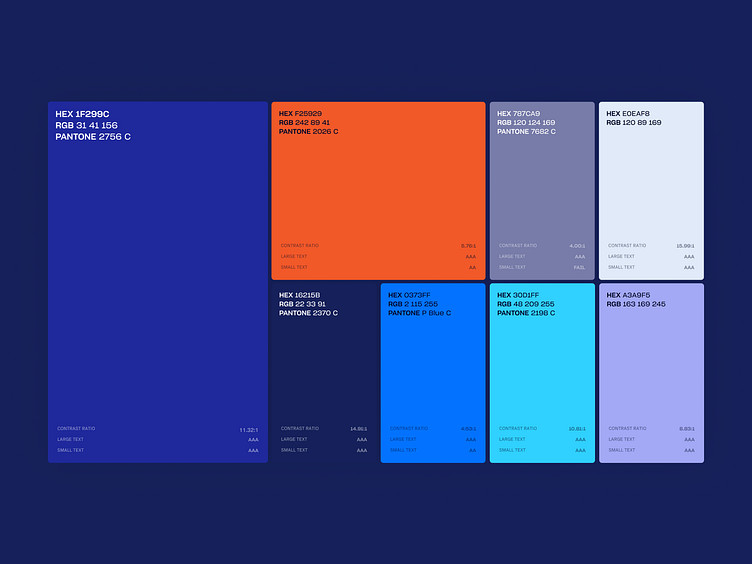
The color palette is heavy on blue colors to present the brand as a trustful and reliable. The nuances are combined—we have youthful and more mature colors, reflecting the gravity of BetaPeak and the unhackneyed new products they help.
All colors were tested for their contrast ratios to make sure the texts will always be readable.
↬ ↬ ↬
Oblik Studio is a result-driven design and development company. For the past 5+ years we worked with 50+ happy partners on UX, branding and development projects. Learn more about us at oblik.studio. We are available for new projects, say hi 👋
Follow us: Instagram • Twitter • GitHub • Medium • Gumroad • Behance