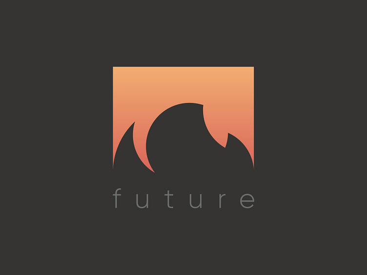
Fire Logo Concept | Biofuel Company
Shot! 🔥🔥🔥 Negative space games are here.
💡 Fire logos are overused, so we took a look at the opposite side - smoke. We created a square to fit an icon and divided the space inside on two parts. One is invisible - fire. The other - smoke is visible. It shows us a process of getting an energy.
😉 This concept was declined, but maybe you'll find an inspiration for your future work.
Do you like negative space logos?
Thank you for your attention! 😘
Give me some thoughts to think about:)
More by Andrii Zarypov View profile
Like
