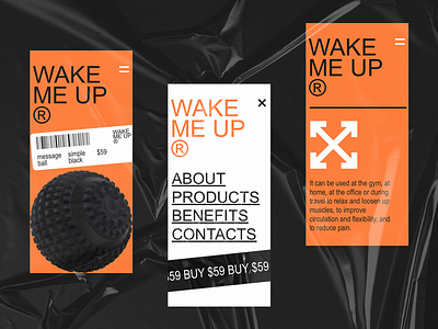
Mono Ecommerce Mobile Website
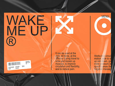
While some ecommerce websites are created for the diversity of items, the others concentrate users' attention on one narrow offer. The business goals shape the focus. Today's shot gives another glance at the simple and stylish website promoting and selling a particular product, the special equipment for self-massaging giving the person more energy to wake up for new challenges. Earlier we showed web interactions for it, and here you can see the mobile view. The design is based on brutalist approach, bold typography, high scannability, prominent product image, and limited contrast color palette. Stay tuned to see more!
Also, welcome to review our set of design tips on improving web readability and learn about the popular types of helpful visual dividers in user interfaces.

