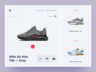
YouYoung Product Page
Hey, friends!
Quick overview: the platform lets you browse the latest trends and view our great selection of boots, heels, sandals, and more.
Objectives: the main goal was to give tactical thought to the navigation structure, create a right color combination, font size, and font color to ensure that visitors do not have any problem viewing product details. Finally, develop an e-commerce design system.
Used fonts:
• Montserrat: a great choice for the strong emphasis (bold, especially)
Don't forget to press "L" if you like it and check out attachments.
Cheers!
More by Serhiy Ozhibko View profile
Like
