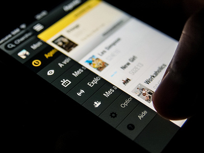
TVShow Time redesign - menu
(Actual screenshots attached)
We used a fly-in menu pattern to provide a consistent quick access to all sections within the new version of TVShow Time.
This proved to be effective to manage the access to 6 sections but it required a little time from the users to get comfortable with, as opposed to the old tab pattern they were used to.
More by Valentin de Bruyn View profile
Like


