Twitter Client Fun Design 2
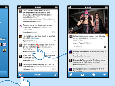
Looking at a detail view. Not much different here from the official client except for image stacked _above_ the initial comment and retweet, favorite and reply actions as a contextual menu at the bottom instead of inline with the highlighted tweet.
Kept the icon in the bottom right to trigger slide up menu, and thinking of replying on a gesture (sideswipe or pinch) to move back in the the situation when you've drilled down a lot...
would love to hear your thoughts and critique! :)
bigger view here: http://goo.gl/O3BTd
More by Mathew Sanders View profile
Like
