F E monogram griglia scuro

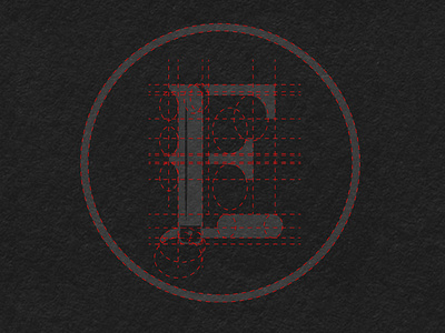
For the construction of this logo I used a font serif and a minimal illustration of a barber razor. I designed this logo for a barber shop. At the base of the design of this there are two key words: class and vintage. That is why I thought of using a serif font for the letters "F" and "E". I also wanted to combine an old shaving razor, a classic reference to the old barber trade, to the monogram.