BackerKit Newsletter Redesign
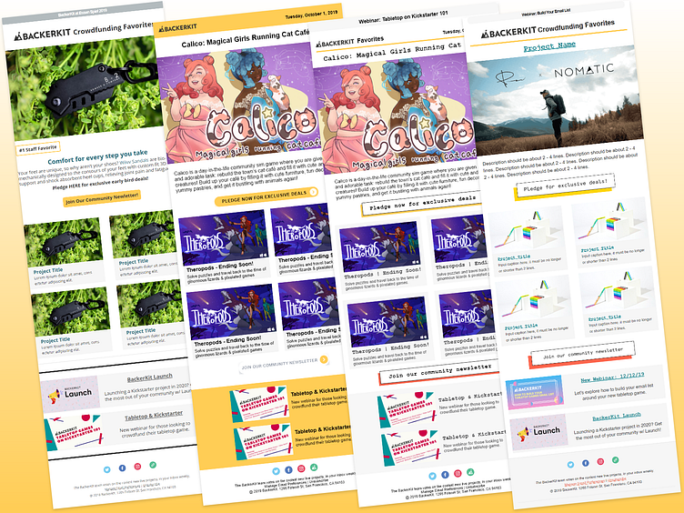
A redesign for BackerKit's newsletter to match the redesign of the website and improve the conversion rate for features in the top spot by creating a clear Call To Action to pledge now.
From left to right: - Original design with no clear CTA for the top feature.
- First draft intended to make it feel like a morning newspaper and to have an eye-catching button that encourages readers to check out the top featured project.
- Second draft matches the website redesign's buttons, fonts, colors, and cards.
- Final version made in Mailchimp within its capabilities.
More by Luna View profile
Like
