Homescreen scroll views
We are constantly iterating on the homescreen of our mobile app. I really like the layout we have now because there is a lot of good logic behind the hierarchy.
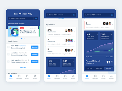
Recommended actions and soon-to-be-due Next Steps are above the fold. The intention is to make it easy to get started, and present personalized tasks based on usage.
Just below the fold is the contact Funnel where we present the most likely sellers in an agent's personal network as Opportunities. Agents can pick out people they want to focus on and organize them in 2 buckets (In-Flow and Hot) based on how often they want to be reminded to follow up. A count of the deals they've won and deals they've missed from the contacts in their network is just below the Funnel with a different visual treatment.
Finally at the bottom of the homescreen is a summary of how effectively they are winning (or missing) the listings that happen in their network.
The ability to see deals they've missed, and get notified as they happen, is the most unique value provided by First. By showing them how many deals they could be winning, but aren't, we hope to motivate agents to take advantage of our industry-leading data science and connect with their 3-Star Opportunities.