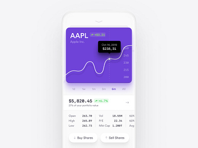
Analysis — Investment App
In 2019 most users have large phones and it's hard to use apps every day which are designed only for two hands using. That's why I really love the One UI by Samsung and trying to keep the main idea in mind when designing new apps. That's why I didn't use back arrow on the top left corner which is hard to reach using only one hand. Also, I was trying to keep as much as possible of the navigation on the below part.
If you have some projects I'll be glad to help you with. Just ping me via email — andrew.dsgnr@gmail.com
Let me know your thoughts, please 🙂
More by Andrew View profile
Like
