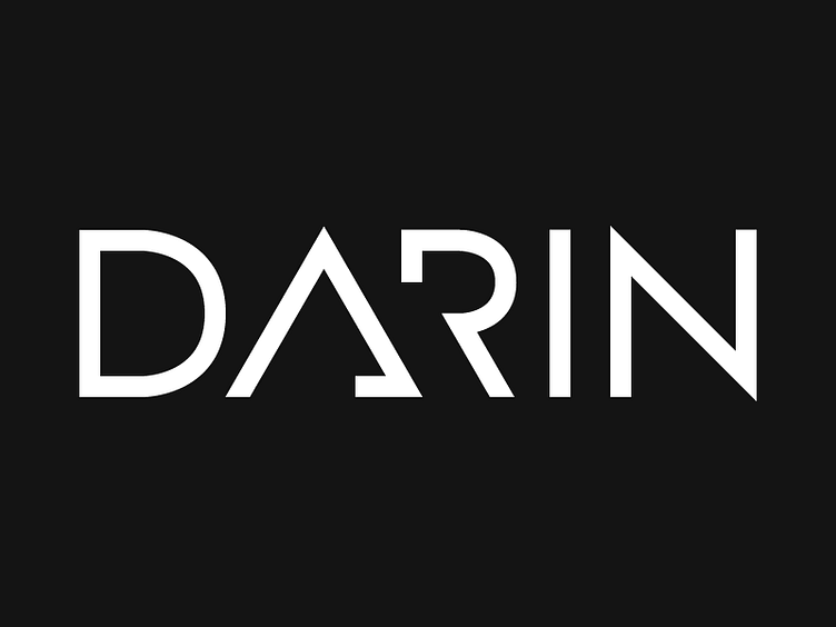
Darin Logo (rebound)
Really dig this concept @Eddie Persson. I think it would work much better if you used a right triangle for the A and use the same angle for the stem of the R. I adds more balance and a better sense of placement. What do you think? Hope you don't mind this rebound and feedback. Welcome to Dribbble! :)
More by Danny Zevallos View profile
Like

