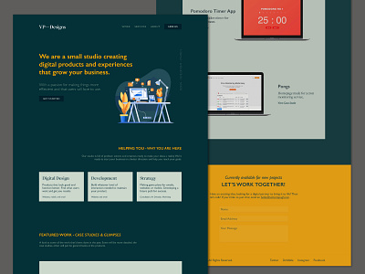
VPDesigns Redesign v3
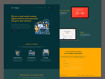

Really liked the illustrations so I doubled down on them. I was looking for icons, but they didn't look as great as these icons. The icons are eerily similar to the color scheme, so that might be why. I took away the big blocks of color and streamlined it even more. Much more happy with this layout, one page down!
Any feedback is welcomed.