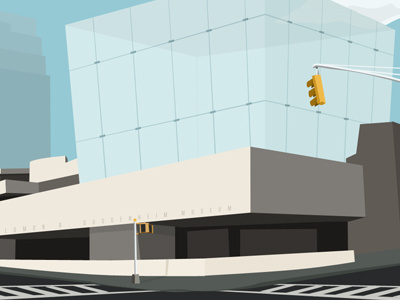
Guggenheim
Hey guys! Since "re-imagining" things is the new black, I thought I'd take a stab at it too. This is my take on the Guggenheim. Since it's my least favorite museum in the city, I thought I'd make the exterior look cool so that I'd be encouraged to visit it more often.
A few thoughts on the design:
The current design sucks. Everytime I go there I get exhausted from walking up those 6 flights. I mean, when I go to the Guggenheim I go to see art, not to shape my calves. Also, not sure what the designer was thinking, but the structure is round and we all know that round is kind of lame. Squares are where it's at. So I came up with the idea to replace the structure with a large square.
Now, seeing that the 5th ave Apple store attracts so many people a day, looks absolutely beautiful, AND is shaped in a square, I thought why not re-appropriate the same design for the museum. I mean, hello, it's APPLE! They know what their doing.
So I propose to replace the current shitty circle thing with a smooth and gorgeous glass square. It will be completely sealed and protected from the rain, so no need to worry about the works of art. This will be achieved by using all the modern glass techniques available in todays market.
The inside architecture would be designed just like the 5th ave Apple store too. So instead of going up 6 flights, you go down 6 flights. I'm sure this is technically possible, and there are no legacy issues like subways and other shit I can't think of.
As for the radical change to the entire structure, I'm not too worried because I know that people love change. As I always say: best to radically change things on visitors rather than iterate slowly.
Anyways, I guess that's it. In conclusion, systematic.


