Illustration | Pantone 🎨
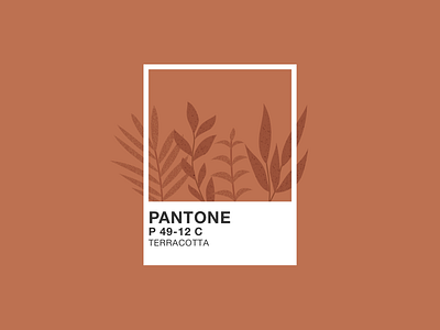
🇫🇷(English below) Est-ce qu’on en parle du Pantone 2020 ? 🎨 Personnellement, je suis assez déçue de la couleur qui a été choisie… Je trouve qu’elle ne représente pas tellement les tendances actuelles qui sont plutôt tournées vers des couleurs naturelles et douces. J’ai donc créé ma version de ce qu’aurait du être la couleur de l’année, à savoir un beau terracotta.
💬 Que penses-tu du Classic Blue ? Toi aussi tu aurais préféré un terracotta ? #teamterracotta
🇬🇧 Can we talk about the new Pantone 2020? 🎨 Personally, I am quite disappointed with the chosen colour… I think it doesn’t represent so much of the current trends, which are more oriented towards natural and soft colours. So I created my version of what should have been the color of the year, a beautiful terracotta.
💬 What do you think of the Classic blue? Do you prefer a terracotta color? #teamterracotta