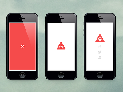
DFCO Splash Mobile
Kicked back this Sunday and came up splash page concept to put up while I build out the redesign of my portfolio. If you guys don't use Silkscreen while designing for mobile or tablet – I highly recommend it. Changed my life. You can sync Photoshop, Illustrator, Fireworks, and any image file type. Super nice :D
Anyways, the UX:
1st Screen
Red fades in from white, then the atom slides/fades in and starts spinning while the page loads.
2nd Screen
Red fades out revealing the rounded triangle, white frame border fades to subtle gray.
3rd Screen
Logo slides up and the dribbble, twitter, and contact icons fade in sequentially.
Would love to hear everyone's thoughts on the UX. I know text might help clarify the icons but then again I think they are all pretty recognizable.
Also, attached the real pixels if anyone is interested :P

