Alliance SOC - Brand Identity
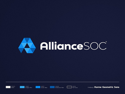
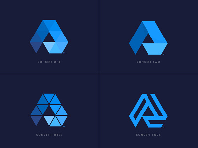
Really loved putting this project together, as you saw from the previous posts, it was a long process with lots of different concepts, but in the end i went with this one mainly because a good brand identity should have no more than 4 - 6 main colors 🎨
The triangles overlapping each other serve to emphasise the alliance aspect of the company.
Here's a little challenge - how many triangles do you see on the logo?
--
📨 Got a project? Let's work together! Email: wisecrafted@gmail.com
--
More by Wisecraft View profile
Like


