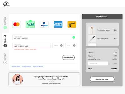
[BRANDED] Credit Card Checkout for the SHOPR
This is what I love about design - iteration. When I started adding visual design, I started seeing some UX issues:
1. Side tab was not useful - moved to menu bar
2. Confirm order button during 2nd phase of checkout is redundant
3. Testimonial section needed to be on brand
4. More headers explaining where the user is
For the story behind the design - if you haven't guessed it, it's a parody to Marie Kondo's new online store for expensive things you don't need.
------------------------------------------------------------------
Any feedback is much appreciated. Please hit "L" if you liked this project! It really helps.
Want to collaborate? Have some design work to be done? I'm your guy! Send a "hi" to:
domingojofo@gmai.com
002 checkout creditcard dailyui dailyui 002 design design challenge illustration payment product product design ui ux uxdesign uxui
![[BRANDED] Credit Card Checkout for the SHOPR](https://cdn.dribbble.com/users/1480130/screenshots/8810921/media/384487facd8fb04a640bd09d64be519e.png?resize=400x300&vertical=center)
