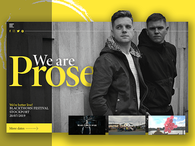
We Are Prose
Website interface design for the best UK import of this decade, Prose Music. If you haven’t listened to them, you should. In a class all their own. Anyway, today’s goal was to create a monotone interface, with just a splash of color. I think I ended up with more than a splash, but I think it worked. Haha! I really enjoy coming up with designs or musical artists, because there are so many things to consider—album releases, tour dates, videos, march, and a million other things. It takes a lot of forethought to make it work without it feeling cluttered. Anyway, what do you think?
More by Sam Daugherty View profile
Like
