Futured — Visual Identity
In the beginning of the year I had a pleasure to work on project, that I would say was the most interesting to work on, because rebranding a development company is always a challenge, as you need to be sure to be accurate.
After a few months of work we ended up by choosing the simplest form of logo, that was basically an outcome of my experiments, where the F was a capital in full custom logotype, but we made a decision to just keep the F and fit some nice typography with it.
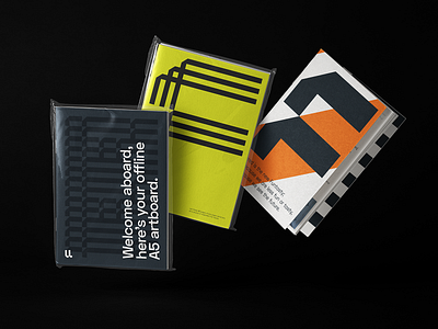
I had a tough time doing all the necessary assets for client, as you can imagine there were many, but the outputs were simple rewarding, such as these nice onboarding A5 notepads or the epic neon inside the offices!
Stellar work made on the website by Madeo
Hope you like the result!
Charlie


