Delightful empty and error states
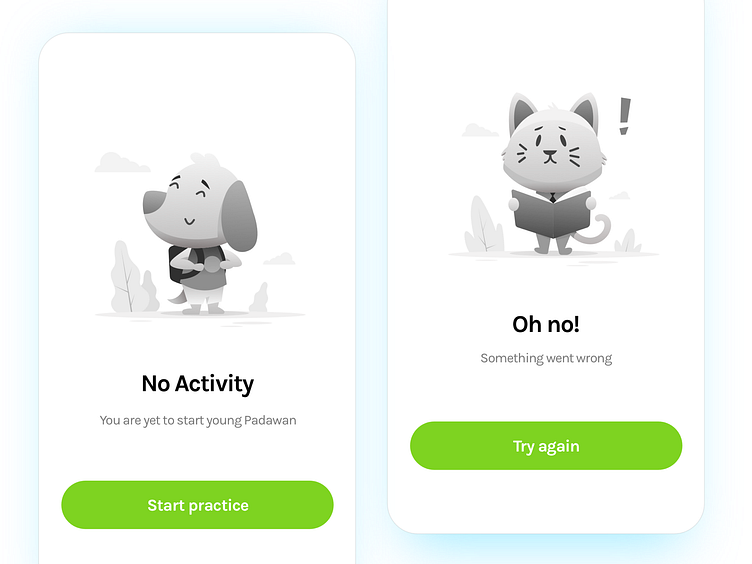
Delight in design allows organisations to develop a friendly and warm relationship with their users. Increasing relatability and empathy, Delight becomes a vital part of branding. Here are examples of an empty state and an error states(left to.right).Such states occur when there is a nudge in the users anticipated flow. Relatable imagery along with a clear CTA helps humanize these nudges and ease in the negative aspect of the situation, reducing anxiety within the users, guiding them to way to resume.
These here are cases for an e-learning platform for classes 5th-12th. We made a decision to use animals in a learning environment (with books and school bags)
Relatable.Expressive.Gender Neutral.
Based on personal experiences and learning from @Arjun Arunkumar's talk on "Delight in consumer products."
