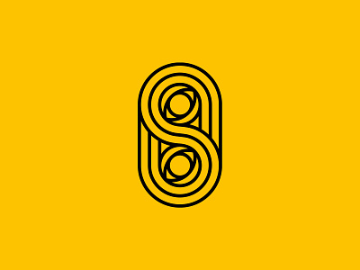
Secretly Swedish – Logo Design
As I undergo a brand refresh, one of the first things to address was my primary logo. I wanted to retain the "double eye", which has been synonymous with my design identity, since choosing to brand myself as Secretly Swedish, way back in 2008.
I've never really incorporated the double 'S' into any of my brand visuals before, beyond some previous wordmarks. However, this time around I wanted it to be as important to the logo as the eyes were.
I've always been weary of how to present 'SS' visually, due to the negative association that goes with that particular initial pairing. Creating something of infinite 'S' helps to create that double initial.
More by Secretly Swedish Design Co. View profile
Like
