menu
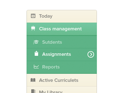
Update: Added the sub selected state for the both and aligned the icons in center in the blue version.
Please see the attachment first.
Its a menu for a project I'm currently working on. Green is the client's pick but i like the blue one.
More by Zulal Ahmad View profile
Like

