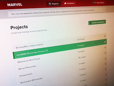
Project Page
Me and my mate are building our first SaaS!
I did a version before with gradients and shadows but honestly it looked like shit and I was trying too hard so I deleted everything, took a breath and worked slower to try and do something flat.
Easier to build and nicer to look at (i think)
The placement of the project and feedback button is weird, I'll prob move them closer to the user button.
Full pixels attached.
More by Murat Mutlu View profile
Like

