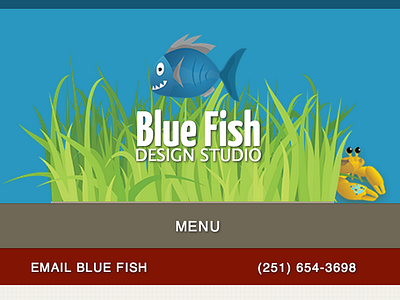
Blue Fish - Mobile
Just working on the mobile version of the site. Making sure that the contact information is front and center. Not terribly confident with the red even though I know that it draws a user's attention. Thoughts?
More by Marcus Neto View profile
Like
