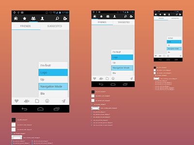
Telly Android Holo Assets
I've been working a lot lately into mobile design and with the dev teams. Both iOS and Android. I've also been realizing, that implementing a design into mobile (both Android and iOS) is HARD (very) for a developer. It's not at all small, cheap css magic. Making a pretty design is not all. You also have to communicate accurately the design to the developer.
This has told me 2 very important lessons:
1. Always try to stick to guidelines the most you can.
Breaking a guideline can be tedious for both you and the developer (assets madness, code hacks). The OS can be made in a way, that your new style will be very hard to implement. Don't be a punk designer breaking guidelines for the sake of aesthetics and try to get something beautiful, respecting guidelines. You will cut implementation work time by at least 50%.
2. Prepare clean asset files.
I know what you're thinking, it's horrible, tedious, and you got better stuff to do. But unfortunately, as you're not a mobile developer, your developer is not a Photoshop guru and he won't know how to read your files. Thus, try to communicate a LOT with them. Teach them how to read your photoshop files. Also prepare very accurate, detailed, and CLEAN asset files. Your developers will love you!
To illustrate this is what I've been doing this past 3 days. I've decided to retouch slightly the Telly android design. And to stick to Google guidelines.
After reading all the guidelines, and talking for hours with the dev team about how assets are managed for GUI parts, I used this link to base my design and assets I will be preparing.
Then it was pretty easy. Come up with a new concept, prepare xhdpi, hdpi and mdpi design and finally prepare all the asset files for the integration.
This is the final result of it. All assets are sliced so I can export them straight up to the "res" bundle and edit android style xml files. This way the development team will only rely on an exported android ready bundle and not on a psd.
Here's the full sized version of it.

