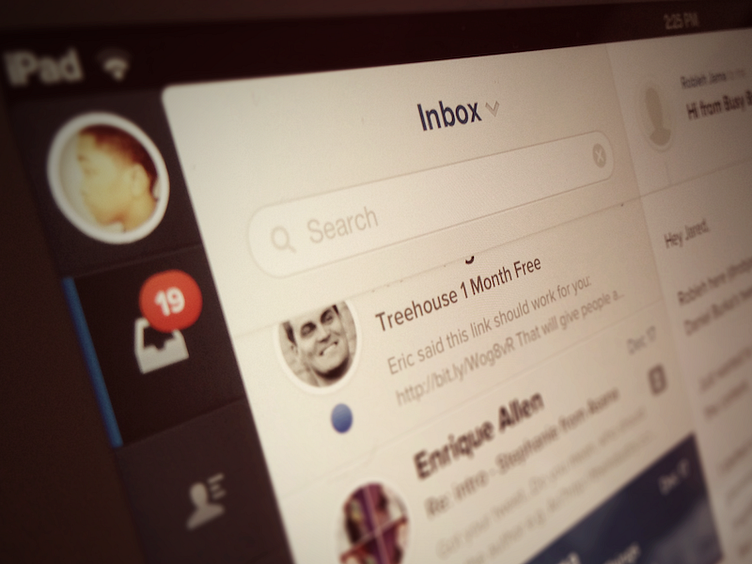
Evomail Top Section
This is the shot I used for an article I wrote on lessons learned from designing Evomail.
It's the app running on my iPad. Visible are the account switcher (avatar), sidebar nav, search, inbox, and an open email.
More by Jared Erondu View profile
Like
