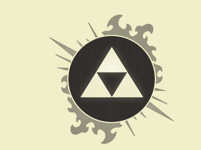
Zelda Timeline rebound
It's a good start @Phil Stringfellow, it seems a bit empty in the bottom right hand corner though so the overall logo feels unbalanced. Maybe you're planning on putting something else there?
Perhaps mirror the spikes (but reduce the scale of both sets so their more balanced with the tribal flame thing?! and I'd also reduce the opacity of the outer details so as to not detract from the Zelda logo..
ahhh, screw it, let's rebound it. I don't think I'm making myself clear.
If in doubt, draw it out :)
More by Anthony Killeen View profile
Like

