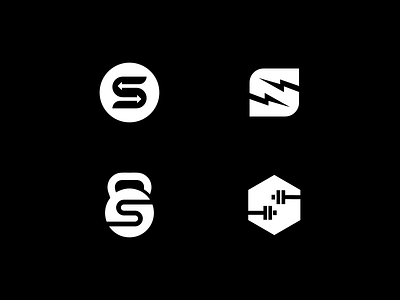
Gym & Fitness logo design concepts.
Logo designs for a gym 💪. Which option represents the industry the best? 😮
_
Since i like to workout, this project was really fun. I tried to use negative space as much as possible because of client's request.
Ideas:
1. S + arrows. Arrows represent the change. First one is you at the moment and second one the change version of you.
2. S + bolt. Since there is lot of energy burning,i added lighting bolt as a symbol to that. Also shows explosivity.
3. Kettle ball + s. One of the items that is used a lot is indeed a kettle ball.
4. Weights + S. Since there is no gym without weights,i made one version with it too.
More by Emir Kudic View profile
Like
