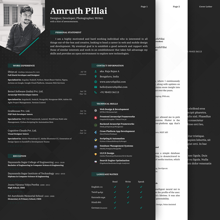
Revamped Resume (Dark Mode)
I think it's been a while since I had last designed my resume, the print version. It was around 2 years ago, and I was a completely different person back then. I've heard the saying, a resume is like a reflection of oneself, so if I'm bound to change, so should that nifty little document.
Hence, here's my latest resume, and like most apps on the interwebs, even it has caught the dark mode fever. I'm also finally moving away from the one-page resume to a three-page CV, with the cover letter. This may be a sign of growth? No idea, but it looks heavy!
Some things I focused on while making the resume, 1) make sure it can be parsed, 2) make sure it is easy to edit once you have a new field and 3) make sure looks GOOD! (and you can be the judge of that)
It was designed entirely from scratch in Figma, and I will be making the files open source so you can use the template to design your own resume, or even mix-match colors as well. Drop me your email address if interested and I'll share the file with you.
You can browse through the entire resume here: http://pillai.xyz/resume-pdf
Please feel free to leave any comments ;) I'm posting on dev.to so I can get some constructive criticism from people who have taken a lot of interviews already.
I'm currently scouting for a job in Berlin, Germany (looking to relocate), hence the new redesign and weekend exercise.
Thank you all so much!
