Widget UI - revised
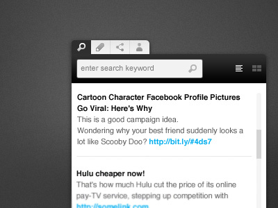
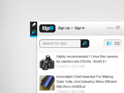
Had to revise the UI, realized we need few more features without consuming too much of screen real estate. And most important ! Making it as light as possible.
Overall, more minimal. Removed the prominent branding, since its something a user would be using after being a member of actual product - the Web-app. So, not a good idea to just keep throwing him a huge logo all the time, that he knows already. After all, you are the king Mr.User :)
More by Nitin Garg View profile
Like

