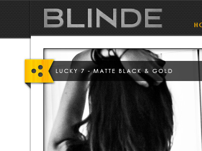
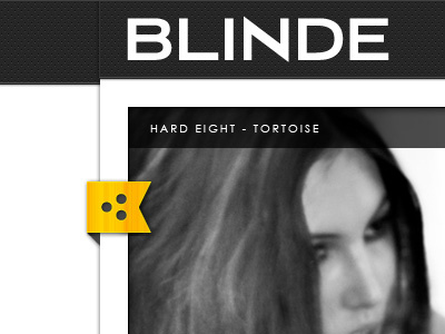
Ribbon and Logo Revisions
The bright white logo was bothering me so I switched it up a bit. I also aligned the info bar with the ribbon, and I'll probably move the whole nav/info element to the bottom of the image for the working site.
More by Bryan Crabtree View profile
Like

