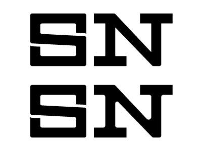
Logo explore #4
Took Mike Scribner's advice and rounded the edges of the N. Definitely helped. Top one is more subtly rounded and while I liked it initially, I think I'm leaning towards the bottom mark.
More by Scott Neuberger View profile
Like

