Yoga App
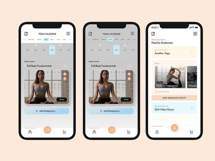
3 variations of the same screen. The grey in images looks on the dull side but on a mobile screen comes out pretty sharp and clean. The idea is to show a calendar screen where the user can see their activity. There are different types of "yoga sessions" that the user can undertake, used with color coordination for the type of yoga sessions that they are. Really confused from these 3 which is the best one. Thoughts?