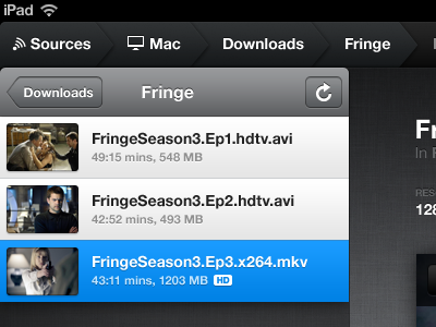
Air Video Personal Redesign
Had a quiet weekend so decided to work on a redesign for the hell of it. Air Video is probably my most-used app on my iPad, and to be honest, for the most part the interface is really great. But I think it could be better.
I've reworked the UI throughout to polish and refine it, but I've also mocked up a UI that isn't in the current app - a grid view. I hate getting bogged down in folders within folders within folders to find a single movie - I want to be able to pan around a wall of *just* movies.
I've put up a page with fullviews here, including list and grid views for iPad and iPhone 4:
http://dizzyup.co.uk/airvideo/
I haven't worked with InMethod on this at all, this is purely a personal project for fun :) That said, their app is awesome and you should download it! http://inmethod.com/airvideo
If there are any Air Video users here, I also did a quick redesign of the Menubar icon on the Mac a while ago - http://drbl.in/vwN
