New Pricing Block
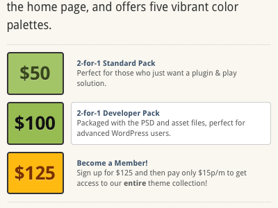
I've been busy modifying our product page this weekend and decided that the first thing that needed changing was our current select package block. Here is an example of the current layout. We needed to display more info about each option as it is the question we get asked the most. So this new layout is my solution (the $100 option is the hover state).
More by David Perel View profile
Like
