Corporate identity for the Family Service medical center.
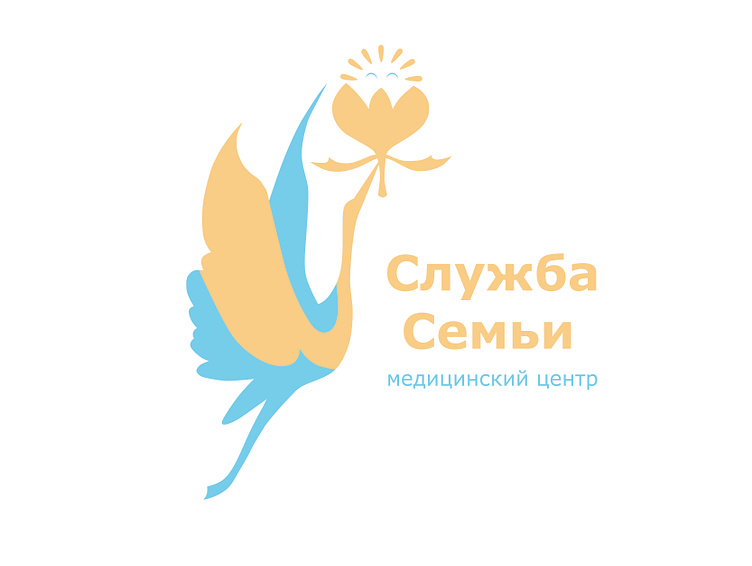
A logo sign is a system of graphic elements subordinated to a single meaning. The image of a bird rising upward, bearing a drop-down flower bud, in which is a baby whose graphic pattern echoes the sun, its rounded shape, where the rays are transformed into elements of the baby’s hairstyle. This graphic series, as well as possible, reflects the high goals and objectives of the Family Service medical center, the work to achieve the main, important, necessary - strengthening and maintaining reproductive health and the ability to give a new life. Знак логотипа представляет собой систему графических элементов, подчиненных единому смыслу. Образ поднимающейся ввысь птицы, несущей раскрывающийся цветочный бутон, в котором - малыш, чей графический рисунок перекликается с солнцем, его огруглой формой, где лучи, преобразованы в элементы прически малыша. Данный графический ряд, как нельзя лучше отражает высокие цели и задачи медицинского центра “Служба Семьи”, работу на достижение главного, важного, необходимого - укрепление и сохранение репродуктивного здоровья и возможности подарить новую жизнь.