Corporate identity for the Family Service medical center.
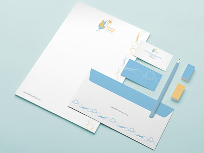
The corporate style developed for the medical center “family Service " continues the theme and idea inherent in the logo. The graphic solution is made in the form of intertwining two lines-yellow and blue, resembling the plastic and structure of the DNA chain, alternating with a spherical shape, assembled from small modules of teardrop shape, again referring the viewer/future customer/consumer services to the symbols of the origin of life-the egg, the sun. The philosophical approach was fundamental in the development of this style: the idea, high goals, serious tasks should be solved through deep images, because the goals and objectives of the center are truly significant for every person. To corporate colors, in addition to blue and yellow, white is added, it is the background and the percentage prevails over blue and yellow, perfectly refreshes the listed two and continues to help maintain the overall style concept.
Фирменная стилистика, разработанная для медицинского центра “Служба Семьи” продолжает тему и идею, заложенные в логотипе. Графическое решение выполнено в виде переплетения двух линий - желтой и голубой, напоминающих по пластике и структуре цепь ДНК, чередующихся с шарообразной формой, собранной из мелких модулей каплевидной формы, опять же отсылающей зрителя/будущего клиента/потребителя услуг к символам зарождения жизни - яйцеклетке, солнцу. Философский подход был принципиален при разработке данного стиля: идея, высокие цели, серьезные задачи должны решаться через глубокие образы, ведь цели и задачи центра поистине значимы для каждого человека. К фирменным цветам, помимо голубого и желтого, добавляется белый, он является фоновым и процентном соотношении преобладает над голубым и желтым, прекрасно освежает перечисленные два и продолжает помогать поддерживать общую стилевую концепцию.