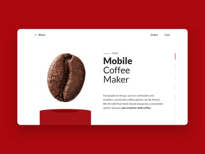
mojoe - Mobile Coffee Maker Landing Page Redesign
After 3 days of my Daily UI challenge, I'm noticing a trend towards minimalism in my designs. With only 3 'main' elements (coffee bean, title, and paragraph), the white space and typography in this design creates a unique experience.
As much as I enjoy a minimalistic approach I know that ultimately it will break a design. I'm curious about which challenge that will happen. I also hope that these challenges will push me to explore outside of comfort zone and test my designs.
Lastly, I'm trying to find the right cadence to my Dribbble shot descriptions, does anybody have a method to their madness?
More by A. Wing View profile
Like
