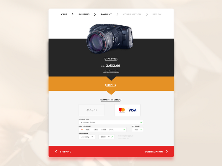
Blackmagicdesign - Checkout Redesign
I enjoy exploring simple, minimalistic designs where functionality and usability are core to the design.
During my process, I continue to ask myself, what can I take away from the design that still gets the user to their goal. Moreso for cart and checkout pages where you're no longer selling a customer on purchasing, but again getting them to complete their purchase. -- *Disclaimer: I have no affiliation with Blackmagic Design, just an avid user of their gear. I wanted to reimagine what checking out on their website could look like. -- Any designers out there enjoy filmmaking?
More by A. Wing View profile
Like
