Lux Logo v02
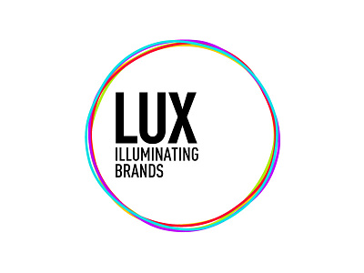
Thickened the coloured circles somewhat, and given the thin text more weight to bring the text and surround together a little more. Also removed the red/coral colour from the text.
For rationale - check the original logo (rebounded)
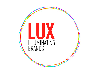
Thickened the coloured circles somewhat, and given the thin text more weight to bring the text and surround together a little more. Also removed the red/coral colour from the text.
For rationale - check the original logo (rebounded)
