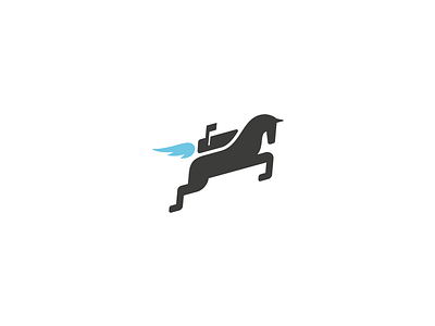
Mochila Logo - Final
Here is the final version of the Jetpack logo for Mochila Mail.
---
Changes:
1- Added a little reference to mail on the Jetpack.
2- Made the flame a more simple.
3- General improvements to the horse, especially the head area.
---
I'd like to thank Max Steenbergen for the initial mailbox idea via Twitter. I think the horse is still nice and simple, while at the same time being more suitable for Mochila Mail.
---
View the attachments for the logo on a dark background, and at a small size. I don't usually add a logo grid, but when I do, it looks like this.
---
I am super stoked with the results and I hope you guys and girls like it too! :)
More by Jord Riekwel View profile
Like


