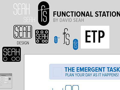
Fill-In-The-Brand Woes
The design of the new year-length planner continues. With the new page design, there's a blank space where I could conceivably put a logomark. As I've dropped PCEO from the series name--no one ever remembers what the P stands for, plus the line has expanded beyond CEO-ness--it's an opportunity for rebranding! But as WHAT? Trying some old logos...none of them seem to work. Thinking that buying Mark Simonson's newish font variation, "Proxima Nova EXTRA Condensed" (emphasis mine) and setting the abbreviation (ETP) would work. That would be the easy cheesy way out.
More by Dave "Sri" Seah View profile
Like
