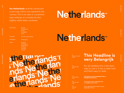
The Netherlands - Logo Redesign 🇳🇱🧡
Logo redesign proposal for The Netherlands. 🇳🇱🧡
Recently I noticed that a Dutch agency redesigned our country's logo. Although it had some meaningful elements, somehow this design received a lot of critiques by fellow dutch people.
The new logo (see on 4th slide) combines the letters NL and include a stylized tulip and was developed at a cost of €200.000. I would've loved to mingle in this redesign assignment and would even give them a discount if that changed the situation! Some good points about the new logo and also some bad ones imo. I think the most important critique about the new design was the non-symmetrical tulip which resulted in confusion to me. I wont say that my proposal would be the best alternative, as I just took this as a project for fun.
I felt this simple but subtle wordmark may been a good fit to keep the design clean and professional. I also felt that the new logo don't use the "the" inclusion anymore, which to me feels off as we always say "The Netherlands" and not "Netherlands. While playing around with the typography I found the subtle use of highlighting "the" from the wordmark a nice touch although not 100% sure it wasn't been done before.
What do you think? Any better or should I leave this as it is? 🤔
Check the 4th slide to see what the current design is.
_____
Are you looking for a logo (re)design for your business? I'd be happy to hear your story! Feel free to reach out! 📨👋


