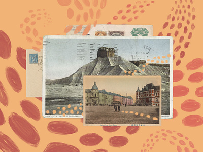
Dot Voting Remix – Editorial Illustration
I wrote about how I remixed dot voting to get better user research in an email redesign. I made this illustration to go with it. I was struggling to nail down a solid direction. In hindsight, I should have let the concept drive the illustration. And, I should have solidified the direction at thumbnail fidelity. Thanks to Matt Wood and Retro Supply for sharing their process, as it helped me create this. #alwaysgrowing
More by Phil Smith View profile
Like
