C

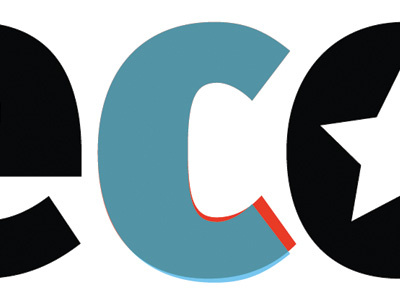
Tweaking FF Meta for the new Decode logo. It was originally my intention to create a more symmetrical C, where the lower half is an exact reflection of the upper half (the blue shape), because I felt that would interact better with the O to its left when displayed at large sizes.
However, I'm not sure. Jon Tan pointed out the relatively drastic difference in the lower curve's angle, so I might just stick with the original C (the red shape).
Either way, it's interesting to compare characters like this. It makes you appreciate the subtleties that go into designing a typeface.