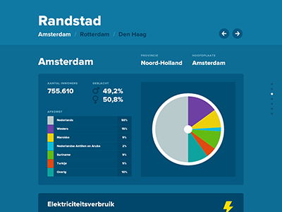
Interactive infographic: 'Energie in Nederland'
As an assignment for school I visualized the energy consumption of several cities and villages into an interactive infographic built with HTML, CSS3 and with use of jQuery and D3.js.
The result is that you can click through the infographic and view the consumption of the place you've clicked on or compare it with the average of the Netherlands or other places.
For a demonstration, click here: http://vimeo.com/55529497
Or try it out yourself: http://remixdesign.nl/energie/
More by Kevin van der Wijst View profile
Like
