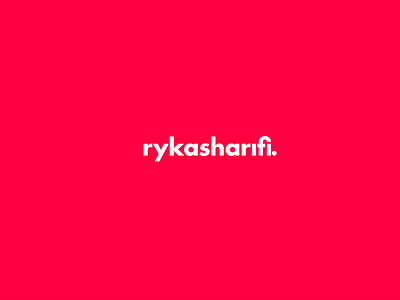
Ryka Sharifi - logo identity
Slick, clean, clever, simple, minimal. My new brand identity and logo; a slight baring to the right to make it naturally easy on the eye, and a clever trick using the dot from the 'I' as the full stop.
More by Ryka Sharifi View profile
Like


