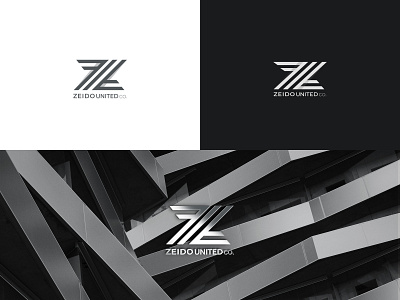
ZEIDO UNITED LOGO AND BRAND IDENTITY
full project here :
https://www.behance.net/gallery/82530269/Ziedo-united-l-brand-identity
The symbol ZEIDO is a network of interaction, partnership and effective fulfillment of tasks. The interlacing of the Z letter in the symbol allows, similarly to the principle of Michelangelo during the Renaissance– to discard everything unnecessary, creating true masterpieces. The diagonal colors strengthen the dynamics of the graphic design and give it a strong and spontaneous character. Zeido united co. doesn’t use a rigid framework for their business. Depending on the task, boundaries can change, as well as the size of the logo. This is why the horizontal placement of the symbol works well with the concept of their business. In addition, the dynamics of the interlacing lines gives the font at the bottom of the logo innovations and aspiration for partnership and success
