F1 Racing App Concept
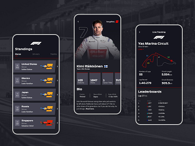
This week our challenge was to display a large amount of information within a mobile app in an accessible, comprehensible manner. Our case was an F1 app.
In this shot you can see a design concept for the overall standings, driver bio and live race tracking. My solution helps the user navigate easily through the most relevant event-related information and statistics. Each screen focuses on one topic and displays just enough information to be easily understandable. Also, I chose the dark theme to be more light on the eye, respecting of course the brands’ guidelines.
I’d love to get your feedback!
More by Halcyon Mobile View profile
Like
