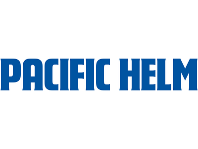
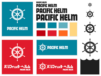
Pacific Helm Logotype
It may not look too different, but there are a lot of little updates we made to our logotype. Firstly, there are small serifs. We also modified the letters to be slightly thinner and vary in weight through the character. Perhaps the most noticeable differences are the E and M, which were redrawn to fit the new serif style. Brad and I worked together on this update.
Here's an image to compare the old and new versions.
Please, feel free to comment below, just keep it constructive. Keep in mind that this is our finished product when you comment! :)
More by Pacific Helm View profile
Like


